1. Hierarchy and Visual Flow
What it is: A deliberate order that tells the eye what to read first, second, and next: Title → Subtitle → Supporting details.
Why it works:
- Preattentive processing: Our brains spot big, bold, and high-contrast elements in milliseconds.
- Gestalt—proximity & similarity: Items that look alike or sit close are perceived as a group, so readers "chunk" info fast.
- Scanning patterns: On simple layouts we default to a Z-pattern; in dense layouts, an F-pattern. Your type blocks should create those paths.
How to use:
- Set a scale (e.g., a modular scale like 1.000 → 1.333 → 1.777 → 2.369) and keep stepping up size/weight for each level.
- Reserve one color or weight exclusively for the title to make it an unmistakable "entry point."
- Keep subtitle line length shorter than title to visually signal "secondary."
- Quick test: Squint test—you should still see a clear 1-2-3 order.
Concrete heuristics:
- Title typically 1.8×–3× the subtitle's size.
- Subtitle 60–75% of title weight/size; supporting lines 40–55%.
Examples to study:
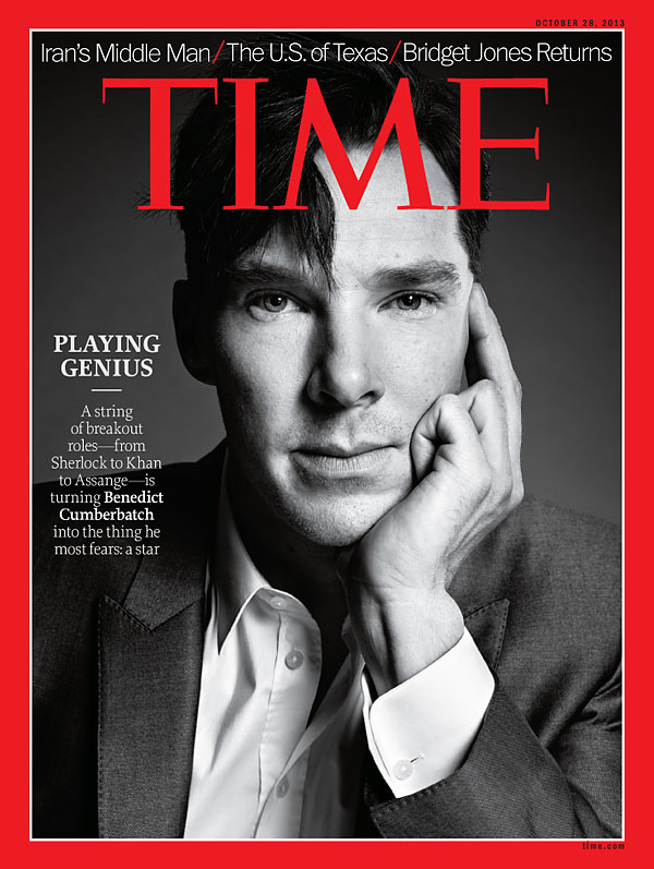
- TIME covers (dominant headline + supporting coverlines).
- The New Yorker (strong masthead; illustration becomes part of the flow).
- Penguin Modern Classics (title hierarchy is clean and unmistakable).
2. Alignment Strategies
What it is: How blocks of text line up—left, center, right, justified, or deliberately off-grid.
Why it works:
- Common alignment (Gestalt): Shared edges create order and trust.
- Symmetry bias: Centered layouts feel formal and calm.
- Expectation violation: Right-aligned/asymmetric layouts feel edgy and modern because they break habit.
How to use:
- Left-aligned: safest for long titles and multi-line subtitles; fastest legibility in Latin scripts.
- Centered: use for ceremony (literary, luxury, minimalism); keep line lengths tight to avoid a "Christmas tree" rag.
- Right-aligned/asymmetric: great for fashion/art; counterbalance with imagery or a bold shape so the page doesn't tip visually.
- Justified: pair with hyphenation and minimum/maximum word spacing controls to avoid "rivers."
Examples to study:
- VOGUE (centered masthead; asymmetric coverlines hugging the subject).
- A24 film posters (asymmetry used for mood).
- Criterion Collection covers (wide range of considered rags and axes).
3. White Space and Margins
What it is: The intentional "nothing" that frames your "something."
Why it works:
- Processing fluency: Clean layouts require less cognitive effort → higher perceived quality.
- Figure–ground: Space clarifies what's important and where to look next.
- Affect heuristic: Minimal clutter feels premium (think luxury brands).
How to use:
- Begin with generous outer margins (e.g., 8–12% of the shorter side) and tighten only if content demands it.
- Surround the title with a breathing halo; avoid crowding edges or faces.
- Use the 60/30/10 density rule: 60% calm, 30% active, 10% accent.
Examples to study:
- Apple ads (type as the hero, space does the selling).
- Haruki Murakami book covers (minimal, contemplative feel).
- MOMA exhibition posters (space as a structural tool).
4. Contrast and Tension
What it is: Differences in size, weight, typeface, and color that create emphasis and rhythm.
Why it works:
- Von Restorff (Isolation) effect: The element that looks different is remembered.
- Selective attention: The eye jumps to the strongest contrast first.
- Color temperature & simultaneous contrast: Warm pops forward, cool recedes; adjacent colors intensify each other.
How to use:
- Size contrast: at least a 2:1 ratio between title and subtitle.
- Weight contrast: mix Light with Bold, not Regular with Medium (too subtle).
- Typeface contrast: Serif + Sans is classic; ensure x-height and mood compatibility.
- Color contrast: For readability, aim for WCAG AA baselines—~4.5:1 for normal text, 3:1 for large text; for covers, push even higher for small thumbnails.
Examples to study:
- Obama "HOPE" poster (high value contrast; condensed impact).
- STAR WARS posters (light/dark drama in title lockups).
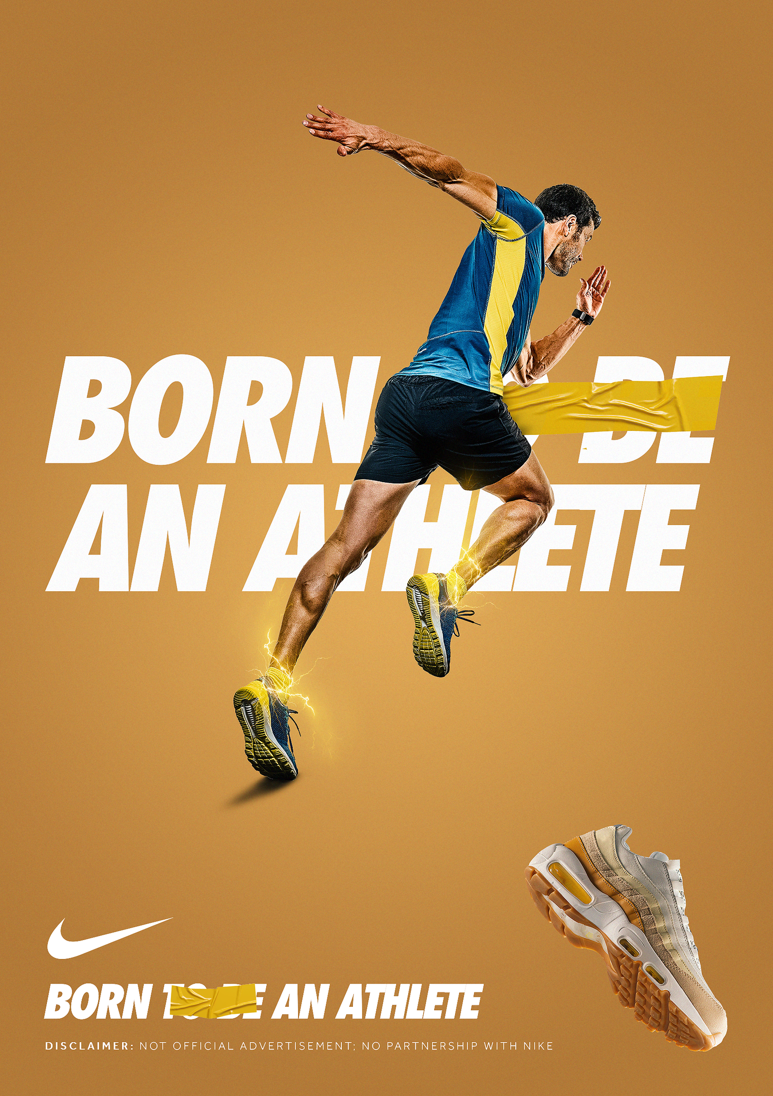
- Nike campaigns (bold type vs. stark imagery).
5. Rhythm and Balance
What it is: The cadence created by spacing, line breaks, and placement; the equilibrium of visual weights.
Why it works:
- Good continuation (Gestalt): The eye prefers smooth paths; rhythmic line breaks feel "composed."
- Balance heuristics: Symmetry reads as calm; asymmetry + counterweights read as energetic but intentional.
How to use:
- Set a baseline rhythm (consistent leading increments—e.g., 4-pt steps).
- Vary line length to create a verse-like cadence (long → short → punch).
- For asymmetry, counterbalance a heavy title with a small dense block (e.g., credits or badge) diagonally opposite.
Examples to study:
- Music posters for electronic/indie festivals (staggered lines, diagonal thrust).
- Massimo Vignelli works (classical, measured rhythm).
- Bauhaus posters (geometric balance with type as shape).
6. Typography Psychology
What it is: Emotional associations that ride along with letterforms.
Why it works:
- We use schemas (mental shortcuts) to map a typeface to a mood: thin-high-contrast = elegant; round-geometric = friendly; slab = sturdy.
- Aesthetic–usability effect: Attractive, congruent type makes users think the content is easier to consume.
How to use (with examples):
- Didone serifs (e.g., Bodoni, Didot): Luxury, fashion, editorial.
- See VOGUE, Harper's Bazaar mastheads.
- Geometric sans (e.g., Futura, Avenir, Poppins): Modern, optimistic, techy.
- See NASA's legacy use of Futura, countless tech brand posters.
- Grotesque/Neo-grotesque (e.g., Helvetica, Inter): Neutral, corporate clarity.
- See Helvetica in Swiss Style posters; Apple's Helvetica Neue era.
- Slab serifs (e.g., Clarendon, Rockwell): Strong, dependable, editorial retro.
- See Wanted-style posters, 1960s advertising.
- Humanist sans (e.g., Gill Sans, Frutiger): Warm, readable, human-centric.
- See UK rail signage (Johnston/Gill Sans heritage), airport wayfinding.
- Script/Handwritten: Personal, romantic, celebratory.
- See wedding invites, craft brands, rom-com movie titles.
- Monospace: Technical, minimal, code-centric.
- See developer conference posters, brutalist web posters.
Tip: Build a type mood board: 4–6 examples that match your story's emotion before you commit.
7. Common Mistakes (What's going wrong—and how to fix it)
- Too many typefaces
- Cognitive cost: More styles = more decisions for the brain.
- Fix: Cap at two (primary + supporting). Use weight/size for variety.
- Over-tight tracking or random kerning
- Legibility hit: Letters blur into shapes.
- Fix: Start at 0/normal; tighten only large display titles; mind pairs like Ta, Yo, AV.
- Low color contrast
- Detection failure: Readers can't parse at a glance (or in thumbnails).
- Fix: Aim for AA contrast or higher and preview at 25–30% scale.
- Edge hugging
- Tension without control: Feels accidental, not dramatic.
- Fix: Add optical padding (title inset 3–6% of width/height).
- Over-justified text without controls
- "Rivers" of white: Breaks reading flow.
- Fix: Enable hyphenation, limit word spacing, shorten lines.
- Ignoring the thumbnail
- Real-world miss: Looks great full size, illegible in feeds.
- Fix: Always test at 160–320 px tall; if it's not readable, bump size/contrast.
8. Case Studies in Action
- Magazines - VOGUE / TIME / National Geographic
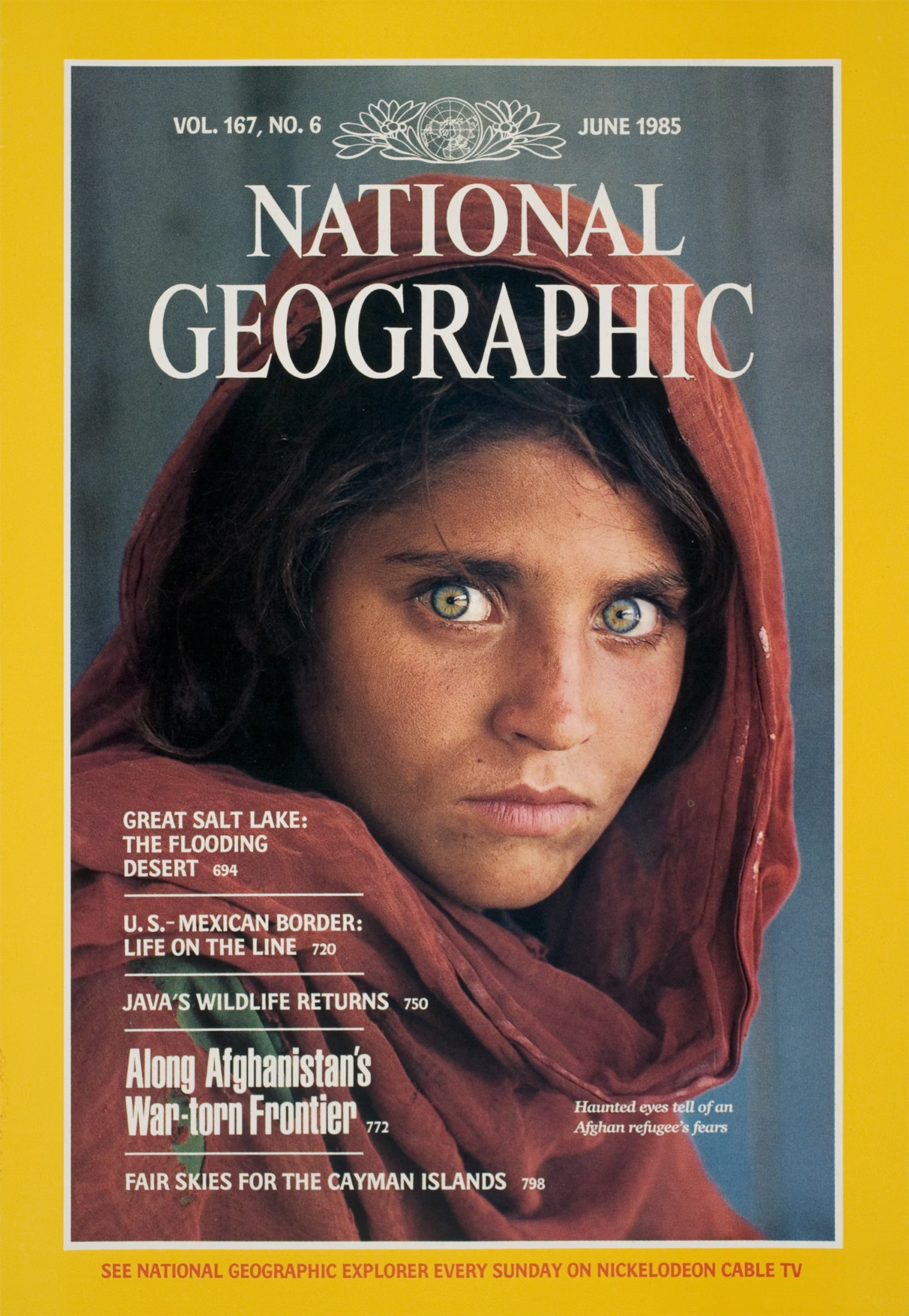
- Why it works: Iconic magazine covers rely on extreme hierarchy: masthead at the top (brand authority), a bold central headline, and smaller coverlines guiding the eye around the subject. Typography interacts with the photograph—aligning or hugging the figure—to create intimacy. The mix of Didone serifs and bold sans serifs amplifies contrast, making the cover both fashionable and timeless.

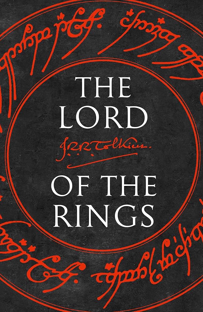
- Books - Harry Potter series / The Lord of the Rings / Atomic Habits
- Why it works: The most iconic book covers rely on clear hierarchy and centered or top-heavy layouts. Titles are often large and occupy the prime focal point, with serif or custom lettering conveying authority or fantasy. Subtitles and author names sit in smaller sizes, creating a vertical rhythm. Generous white space or atmospheric imagery frames the typography, giving the text a sense of depth and timelessness.


- Movie Posters - STAR WARS / The Godfather / Back to the Future
- Why it works: Classic movie posters emphasize title lockups—bold, custom lettering often designed exclusively for the film. These titles are paired with high-contrast imagery and a traditional credits block at the bottom, creating cinematic authenticity. The combination of color contrast + depth layering ensures the title feels larger-than-life, while the logotype becomes etched into cultural memory (Von Restorff effect).


- Posters - Swiss Style / Nike campaigns / Obama "HOPE"
- Why it works: Posters live in public space, so they demand clarity and impact at a distance. Swiss Style uses strict grids, grotesque sans serifs, and asymmetry to communicate trust and precision. Nike campaigns rely on oversized type and kinetic layouts to inject urgency. Obama’s HOPE poster shows how scale, color contrast, and minimal words can turn typography into a cultural symbol. The balance of geometry and emotion makes these posters timeless.

- YouTube Thumbnails - MrBeast / TED / Netflix Trailers
- Why it works: Thumbnails are designed for instant recognition at tiny scales. Huge, bold type paired with high-contrast backgrounds passes the “squint test.” Outline or glow effects isolate text from imagery, while careful layering creates depth between subject and background. This cinematic separation makes thumbnails stand out in crowded feeds and drives clicks.


Handy Workflow Checklist (print-worthy)
- Define emotion first (3 adjectives).
- Pick 1–2 typefaces that match the emotion.
- Set a type scale (modular) and lock it.
- Choose alignment to match tone (left = professional, center = ceremonial, asymmetric = edgy).
- Add contrast (size/weight/color) with at least one 2:1 jump.
- Carve white space: 8–12% margins; halo the title.
- Test thumbnail legibility at 25–30% size.
- Run the squint test for hierarchy.
- Final pass: kerning pairs, rag shape, hyphenation, and collision checks with imagery.